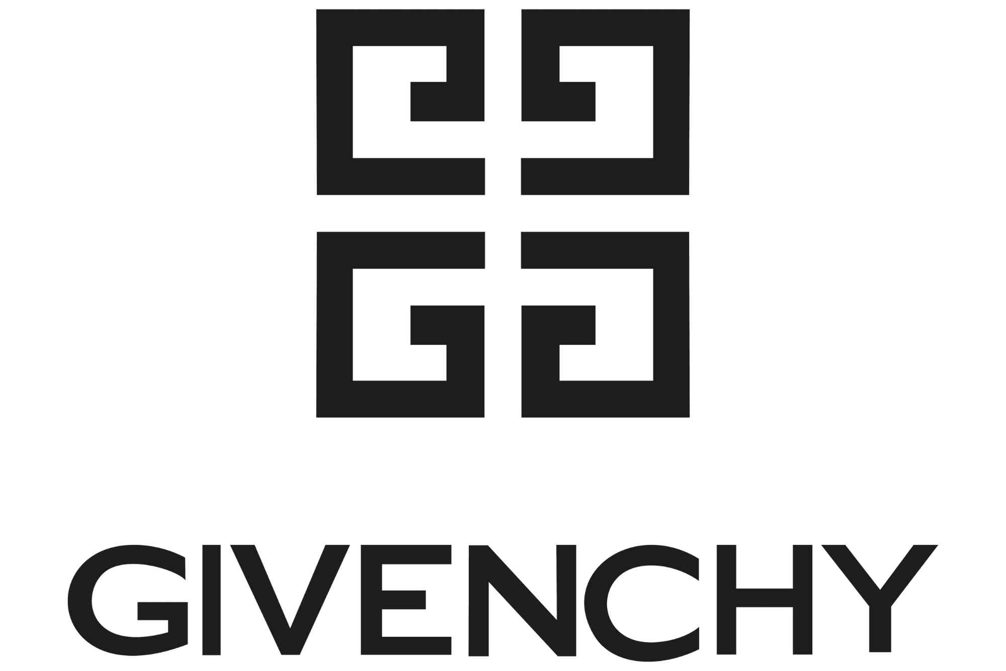
Givenchy Beauty Logo – Evolution and Design
The Givenchy Beauty logo is more than just a symbol; it represents a legacy of luxury, elegance, and modern sophistication. As one of the most recognizable emblems in the beauty and fashion industry, the logo carries a rich history intertwined with innovation and timeless design. In this article, we explore the Givenchy Beauty logo — its evolution, the thought behind its design, and what makes it stand out in the competitive world of luxury branding.
Understanding the transformation of this logo offers insight into how design can both reflect a brand’s heritage and adapt to contemporary trends. Whether you are a design enthusiast, a beauty industry follower, or a branding professional, this deep dive into the Givenchy Beauty logo provides a fascinating look at a powerful visual identity.
The Origins of Givenchy and Its Visual Identity
Before diving into the logo itself, it’s essential to understand the roots of the Givenchy brand. Founded in 1952 by Hubert de Givenchy, the brand quickly rose to fame thanks to its elegant haute couture collections. Givenchy became synonymous with refined style, often favored by iconic figures such as Audrey Hepburn.
The original Givenchy logo reflected the brand’s high-end fashion sensibility, focusing on clean, classic typography that communicated sophistication without excessive ornamentation. This foundation set the stage for the brand’s later expansions into beauty and cosmetics.
Givenchy Beauty Logo: Early Design Elements
When Givenchy launched its beauty division, the logo needed to mirror the luxury and refinement associated with the parent fashion house. Early iterations of the Givenchy Beauty logo retained the brand’s hallmark typography—simple yet strong serif fonts that communicated authority and elegance.
A distinctive element of the logo was the use of the interlocking “G” motif. This geometric emblem, resembling a Greek key pattern, became a central feature in many of Givenchy’s products. It symbolized unity, infinity, and classicism, which aligned with the brand’s ethos.
The combination of clean fonts and the emblem made the logo instantly recognizable on packaging and advertisements. This design ensured that the beauty products could stand proudly alongside Givenchy’s couture offerings.
Evolution Through the Decades
As trends evolved, so did the Givenchy Beauty logo. The brand periodically refined its visual identity to maintain relevance without losing its heritage. In the 1980s and 1990s, the logo saw subtle updates to its typography, opting for more modern and sleek fonts while preserving the iconic emblem.
Entering the 21st century, the logo embraced minimalism, a trend that dominated luxury branding. The Givenchy Beauty logo became more streamlined, focusing on a balanced interplay between the emblem and the brand name. The emblem, sometimes used alone on products, became a symbol of exclusivity and timelessness.
Digital media’s rise also influenced the logo’s adaptability. Givenchy ensured the logo maintained clarity and impact across various platforms, from print to mobile screens.
The Modern Givenchy Beauty Logo Design
Today, the Givenchy Beauty logo represents a perfect blend of heritage and modernity. The emblem remains central, a symmetrical and bold geometric design composed of four interlocking “G”s. This symbol, often referred to as the “Givenchy 4G,” is instantly recognizable and elegant in its simplicity.
The typography accompanying the emblem is clean, sans-serif, and capitalized, reflecting modern luxury’s straightforward and confident tone. The spacing and weight of the letters enhance readability and add a sense of balance.
The choice of monochrome color schemes—mostly black and white—reinforces the brand’s timeless appeal. This restrained palette ensures the logo exudes sophistication and versatility, fitting for various product lines, from perfumes to skincare.
The Symbolism Behind the Logo
Beyond aesthetics, the Givenchy Beauty logo carries deeper meaning. The interlocking “G”s create a harmonious pattern representing unity and strength. This design evokes architectural precision and artistic balance, qualities that echo the brand’s dedication to craftsmanship and creativity.
The emblem’s symmetry also conveys a sense of perfection and stability, traits highly valued in the luxury beauty market. The logo’s bold lines reflect confidence, while its simplicity speaks to elegance without unnecessary complexity.
This thoughtful symbolism has helped Givenchy’s logo become a timeless icon that resonates with customers seeking both tradition and innovation.
Why the Givenchy Beauty Logo Stands Out
Several factors contribute to the enduring success of the Givenchy Beauty logo. First, its clean, geometric design is visually striking and memorable. It stands out on crowded shelves and digital platforms alike.
Second, the logo’s connection to the parent fashion brand lends it instant credibility and prestige. Customers associate it with high quality and sophistication.
Third, the logo is versatile. It works beautifully in different sizes and formats, from the tiniest perfume caps to large-scale advertising campaigns.
Finally, the consistency in maintaining core design elements over decades has cemented the logo’s identity. This stability helps consumers instantly recognize and trust the brand.
Impact on Branding and Market Position
The Givenchy Beauty logo plays a crucial role in the brand’s market positioning. In the luxury beauty sector, visual identity is a key factor in attracting discerning customers. Givenchy’s logo conveys the brand’s promise of elegance, quality, and innovation, making it an essential tool for marketing and product recognition.
Moreover, the logo’s evolution reflects the brand’s ability to innovate while respecting its origins. This balance appeals to both loyal customers and new generations, allowing Givenchy to sustain its competitive edge.
The Legacy and Future of the Givenchy Beauty Logo
The Givenchy Beauty logo is a masterclass in how to build a visual identity that is timeless, meaningful, and adaptable. Its evolution over the decades showcases a careful balance between honoring heritage and embracing contemporary design trends.
For brands and designers alike, Givenchy’s logo offers lessons in simplicity, symbolism, and consistency. As the beauty industry continues to evolve, Givenchy’s emblem stands as a beacon of luxury and sophistication.
If you are fascinated by iconic logos and the power of design in branding, keep an eye on Givenchy’s future endeavors. The legacy of the Givenchy Beauty logo promises to inspire for many years to come.
FAQs
What does the Givenchy Beauty logo symbolize?
The logo’s interlocking “G”s symbolize unity, strength, and timeless elegance, reflecting the brand’s dedication to craftsmanship.
Has the Givenchy Beauty logo changed over time?
Yes, it has evolved subtly to stay modern while preserving core elements like the emblem and clean typography.
Why is the Givenchy Beauty logo important for the brand?
It serves as a visual representation of luxury and quality, helping customers instantly recognize and trust the brand.
Is the Givenchy Beauty logo used on all products?
The logo, especially the 4G emblem, is featured prominently across many Givenchy Beauty products, including skincare, makeup, and fragrances.
What design style does the Givenchy Beauty logo follow?
The logo follows a minimalist, geometric design style, emphasizing clean lines and symmetry for a timeless look.


