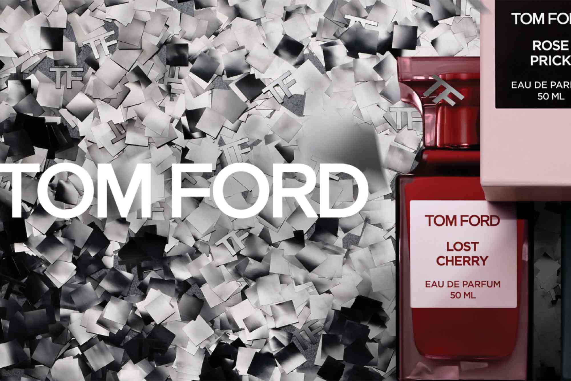
The Tom Ford Beauty logo is more than just a visual mark—it’s a symbol of luxury, confidence, and bold minimalism. As the beauty extension of the renowned Tom Ford fashion empire, this logo embodies the essence of modern sophistication. But what makes it so iconic? Why does it resonate so deeply with luxury consumers? In this deep dive, we’ll explore the design, meaning, and evolution of the Tom Ford Beauty logo and how it reflects the brand’s broader identity in the world of high-end beauty.
The Rise of Tom Ford Beauty
Before analyzing the logo itself, it’s important to understand the brand’s context. Tom Ford Beauty launched in 2011, nearly six years after Tom Ford founded his fashion label. The brand entered the beauty space with the same bold vision that defined Ford’s fashion career—modern, provocative, and unapologetically luxurious.
What set it apart from the start was its strong visual identity. From packaging to product names, everything was designed to exude sophistication. At the center of this identity is the logo—a visual cornerstone that communicates the brand’s ethos at a glance.
A Closer Look at the Tom Ford Beauty Logo
Typography: The Power of Simplicity
The Tom Ford Beauty logo uses a bold, sans-serif typeface. At first glance, it might seem overly simple, but this minimalist style is intentional. The uppercase, block lettering commands attention without shouting. It conveys strength, clarity, and modernism—core elements of the Tom Ford brand.
The use of consistent typography across all Tom Ford products (fashion and beauty) ensures brand coherence. It’s a masterclass in how simplicity can signal luxury when executed with precision.
Color Scheme: Monochrome as Luxury
Tom Ford Beauty predominantly uses black and white in its branding. This choice underscores its luxury positioning. Black signals power and elegance, while white balances it with a sense of purity and restraint. This timeless contrast works especially well in the beauty sector, where packaging aesthetics are crucial.
Logo Placement and Usage
You’ll typically see the Tom Ford logo placed prominently on the front of products—especially lipsticks, foundations, and perfumes. The “TF” monogram, often embossed or engraved, also plays a significant role. It’s a shorthand visual that loyal customers recognize instantly.
This strategic repetition across touchpoints—from online marketing to product packaging—builds visual familiarity and trust.
The Brand Identity Behind the Logo
Brand Voice: Bold and Sensual
Tom Ford Beauty speaks in a confident tone. Its campaigns often feature provocative imagery, echoing Ford’s fashion roots. The logo complements this voice by being assertive yet refined. It’s not decorative; it’s declarative.
This strong identity attracts a very specific audience: one that values exclusivity, self-expression, and sensual aesthetics.
Visual Consistency Across Product Lines
Whether it’s a lipstick or a luxury scent like Tom Ford Black Orchid, the visual branding remains cohesive. The logo sits cleanly against gold-trimmed packaging or sleek black bottles, reinforcing the idea that every product is part of a larger, curated experience.
By maintaining this visual consistency, Tom Ford Beauty ensures customers instantly recognize the brand—an essential element in building long-term loyalty.
Luxury Positioning Through Design
The Tom Ford Beauty logo avoids clutter and ornamentation. This aligns with the brand’s “less is more” philosophy. In a crowded beauty market where many brands use complex visuals or trendy typography, Tom Ford opts for timelessness.
This is where design becomes strategy. The restrained aesthetic communicates that the products speak for themselves—no gimmicks needed.
Evolution of the Logo (or Lack Thereof)
Interestingly, the Tom Ford Beauty logo has changed very little since its debut. This consistency reinforces brand equity. In luxury, heritage and timelessness are powerful selling points. Changing the logo frequently could weaken this perception.
Instead of evolving the logo, the brand innovates through product formulation, packaging design, and campaign imagery. The logo remains the anchor—unchanged, unwavering.
Tom Ford vs. Competitors: What Sets It Apart?
Many beauty brands—Chanel, Dior, Estée Lauder—also use minimalist logos. So, what makes Tom Ford’s stand out?
- The Monogram: The distinct “TF” initials are bold and geometric, creating instant brand recall.
- Masculine Edge: Unlike many beauty logos that lean feminine, Tom Ford’s maintains a masculine, modern appeal—broadening its audience.
- Fashion-Beauty Integration: Because the same logo is used across both fashion and beauty lines, it carries over the prestige of the Tom Ford fashion house.
This integrated branding elevates Tom Ford Beauty above typical celebrity beauty brands, positioning it more closely with heritage fashion houses.
Consumer Perception and Emotional Impact
Customers don’t just buy Tom Ford Beauty products—they buy into a lifestyle. The logo plays a crucial role in this. It represents quality, sex appeal, and a sense of exclusivity. Consumers associate it with:
- Confidence
- Modern elegance
- Urban sophistication
Psychologically, the logo triggers emotions tied to these values. This is why the brand commands premium pricing and earns strong loyalty.
Logo in Digital and Social Media Branding
In today’s digital-first world, logos must work on mobile screens and social platforms. Tom Ford Beauty’s logo excels in this space. The sharp lettering is highly legible at small sizes, making it ideal for Instagram posts, YouTube thumbnails, and e-commerce thumbnails.
Additionally, the brand leverages the TF monogram effectively as a favicon and social avatar—keeping its visual identity strong even in constrained digital spaces.
Why the Tom Ford Beauty Logo Matters
The Tom Ford Beauty logo is a perfect example of brand identity done right. It’s simple yet powerful, restrained yet bold. Every element—from the typeface to the color palette—has been carefully chosen to reinforce the brand’s luxury positioning.
More than a design, the logo is a promise: of elegance, of quality, of confidence. For beauty lovers, it signals not just good taste but a deeper connection to a lifestyle of sophistication.
If you’re a designer, marketer, or beauty brand enthusiast, take a moment to study the Tom Ford Beauty logo in detail. There’s so much to learn about effective branding in just a few letters.
Frequently Asked Questions (FAQs)
What font does the Tom Ford Beauty logo use?
The logo uses a custom sans-serif font that resembles Helvetica Neue Bold. It’s clean, bold, and modern.
Why is the Tom Ford logo so simple?
The simplicity is intentional. It reflects the brand’s minimal, luxurious aesthetic and allows the products to shine.
Is the Tom Ford Beauty logo different from the fashion line?
No, the beauty line uses the same logo as the fashion division. This ensures a unified brand identity.
Who designed the Tom Ford logo?
While no single designer is publicly credited, the logo reflects Tom Ford’s own design philosophy—elegant, confident, and timeless.
How does the Tom Ford Beauty logo compare to Chanel or Dior?
Tom Ford’s logo is more masculine and modern. While Chanel and Dior have heritage flair, Tom Ford leans contemporary and bold.


